Chart Patterns Cheat Sheet PDF Download Free, Powerful Candlestick patterns Book PDF download, All Most Profitable trading chart patterns 2024 PDF free download
Chart patterns are very important for every traders in stock market as well as commodity and forex market.
When you do trading you see daily so many different types of chart patterns on your screen. And after technical analysis you can predict where will the price can go.
And thus we make profits.🤑
But if you understand chart patterns 📈 then you can make regular profits by trading.
So today In this article, we’ll provide a best guide to most important and profitable chart patterns, along with a downloadable PDF cheat sheet, all these patterns will help you to enhance your trading strategies without any cost.
Chart patterns are visual representations of price movements on a stock chart. They show recurring shapes that indicate potential future price trends.
By recognizing these patterns, you can predict stock market movements.
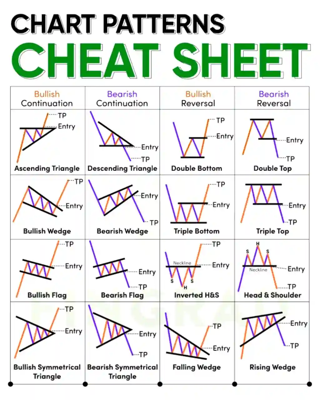
Mainly, they are 4 types of chart patterns–
Bullish Continuation
Bearish Continuation
Bullish Reversal
Bearish Reversal
Download all common chart patterns in one cheat sheet
Here are some common and popular chart patterns that you can download free in PDF format by this cheat sheet.
So before you want to download full PDF cheat sheet of trading chart patterns, now understand each patterns one by one with examples–
1. The Head and Shoulders Chart Pattern
This pattern looks like a person’s head and shoulders. It signals a potential trend reversal from bullish to bearish.
Imagine a chart that looks like three hills. The middle hill is the tallest, and the two hills next to it are a bit shorter. It looks like a head and shoulders, which is why it’s called the ‘Head and Shoulders Chart Pattern’.
Here’s how it works:
The price goes up.
Then it hits a point where it can’t go up any further, and it starts going down.
After that, it goes up again but not as high as before.
It goes down once more and reaches a lower point. (Which called support)
It goes up again but only to the same level as the first time.
Finally, it can’t go higher and starts to go down.
This up and down movement creates the Head and Shoulders pattern on the chart.
The key to using this pattern is to wait for the price to break below the support level (the lowest point).
When that happens, you can enter the market.
Your goal is to reach the gap between the highest resistance level and the support level.
To protect your investment, you can set a stop loss at a ratio of 1:3.
This means if your target is to gain 30 Rupees then set stoploss for 10 Rupees.
In all below chart patterns you can use the same Stoploss ratio 1:3
Now let’s move on to second chart patterns which is–
2. The Double Top and Double Bottom Chart Patterns
These patterns show resistance and support levels.
A double top forms after a price increase and signals a potential downward 📉 trend.
And, a double bottom forms after a price drop and signals a potential upward 📈 trend.
Now let’s understand both patterns in details–
DOUBLE TOP CHART PATTERN:
Imagine two mountain peaks on a chart.
The price goes up to a certain level (first peak),
then drops a bit,
goes up again to about the same level (second peak),
and finally starts going down.
It looks like the letter “M” on the chart.
This is called a double top pattern.
What it means:
It suggests that after reaching a high point, the price struggled to go higher again, indicating a potential trend reversal downward.
DOUBLE BOTTOM CHART PATTERN:
Now, picture two valleys on a chart.
The price drops to a certain level (first valley),
bounces back up a bit,
drops again to about the same level (second valley),
and then starts going up. It looks like the letter “W” on the chart.
This is called a double bottom pattern.
What it means:
It indicates that after reaching a low point, the price found support and might be reversing its downtrend, heading upward.
I hope you understand both patterns.
Use same 1:3 Stoploss as above Head and Shoulder pattern.
Okay now let’s move on to next profitable chart patterns–
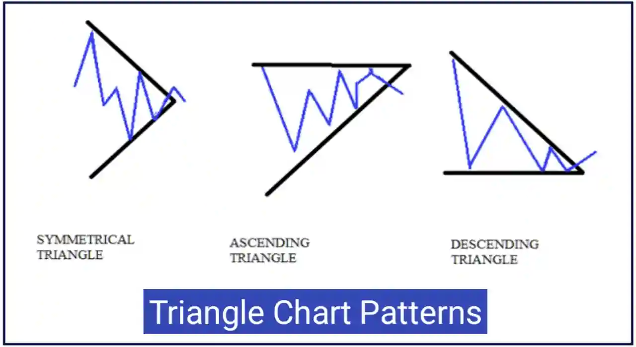
3. The Triangles (Ascending, Descending, Symmetrical) Chart Patterns
Triangles represent price consolidation before a potential breakout.
An ascending triangle shows higher lows and a flat top.
A descending triangle has lower highs and a flat bottom.
A symmetrical triangle has both trendlines converging.
Now let’s understand each triangle pattern one by one–
ASCENDING TRIANGLE:
Imagine a triangle with a flat top and a bottom line sloping downward. It looks like an upside-down right-angled triangle. This is an Ascending triangle.
This pattern shows that–
The price is making lower highs, and it indicates a potential breakout to the downside.📉
DESCENDING TRIANGLE:
Imagine a triangle where the bottom line is flat, and the top line slopes upward. It looks like a right-angled triangle with a flat bottom. This is a descending triangle.
It means that:
The price is making higher lows, and it suggests a potential breakout to the upside.📈
SYMMETRICAL TRIANGLE:
Visualize a triangle where both the top and bottom lines converge, creating a symmetrical shape. It looks like a coil or a spring.
What it means:
The price is forming lower highs and higher lows, suggesting a breakout is imminent, but the direction (up or down) is uncertain.
Now let’s talk about next most important pattern which is–
4. The Cup and Handle Chart Pattern
This pattern resembles a tea cup. It’s a bullish continuation pattern. The “cup” is a U-shape, followed by a small consolidation called the “handle.” A breakout from the handle suggests a potential price increase.
For Example–:
Imagine a cup and handle on a chart. First, there’s a rounded bottom (the cup), followed by a small consolidation or pullback (the handle).
The cup part shows a gradual rise in price, reaching a peak,
And then it forms a handle with a slight dip before potentially continuing to rise.
How to identify this pattern: Look for a rounded bottom followed by a small decline and consolidation resembling a handle.
What this chart pattern shows us: This pattern indicates a potential continuation of an uptrend after a brief consolidation. Traders might consider buying when the price breaks out above the handle.
Next pattern is–
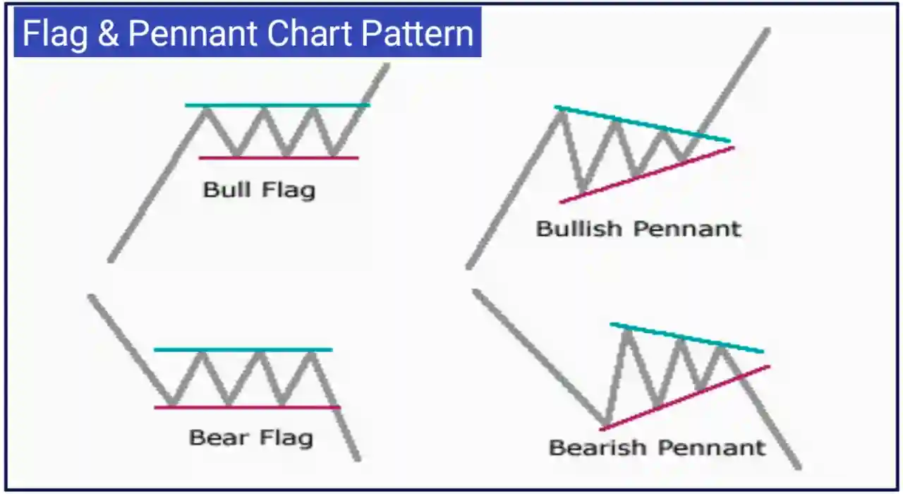
5. The Flag and Pennant Chart Pattern
Flags and pennants occur after strong price movements.
A flag is rectangular and slopes against the prevailing trend.
A pennant is small and symmetrical.
Both patterns indicate a brief consolidation before the trend resumes.
Let’s understand one by one–
FLAG PATTERN:
Think of a flag on a chart – it’s like a rectangle leaning against the direction the price was going. The pole is the first strong price move, and the flag is a little break before maybe continuing in the same direction.
The flag pattern shows a short break before maybe going up or down again.
PENNANT PATTERN:
Imagine a small triangle on a chart – it forms after a strong price move, like a mini flag.
The pennant pattern suggests a quick rest before the price might keep going up or down.
How to identify them:
Look for a strong move, then a little rectangle flag (flag pattern) or a small triangle (pennant pattern).
What they suggest:Both patterns hint that after a strong move, the market takes a short break before maybe moving a lot again.
How to use the Flag and Pennant Chart Pattern?
Entry Point: Traders might buy when the price breaks above the top of the flag or pennant.
Stop Loss: To manage risk, traders can set a stop loss just below the bottom of the flag or pennant.
Target: You can set target, the double of your stoploss or you can simply follow 1:3 (Stoploss 1 & Target 3)
6. The Wedge (Rising and Falling) Chart Pattern
Wedges are similar to triangles but slant either upward or downward.
Rising wedges 📈 show narrowing price ranges and suggest a potential downward breakout.
Falling wedges 📉 show narrowing price ranges and suggest a potential upward breakout.
Let’s understand both patterns–
RISING WEDGE PATTERN:
Think of a rising wedge like a triangle on a chart. It starts wide at the bottom and gets narrower as it goes up.
The rising wedge suggests that the price is going up 📈, but at a slower pace, and it might break downward.
FALLING WEDGE PATTERN:
Imagine a falling wedge – it’s like a triangle, but this time it starts wide at the top and gets narrower as it goes down.
The falling wedge indicates that the price is going down, but at a slower rate, and it might break upward.
How to spot them: Look for a shape that’s wider on one side and gets narrower on the other, either pointing up (rising wedge) or down (falling wedge).
What they suggest: Both patterns hint at a potential breakout – for the rising wedge, it might break down, and for the falling wedge, it might break up.
How to use Wedge Patterns?
Entry Point: For the Rising Wedge, traders might sell the stock when the price breaks below the lower line. For the Falling Wedge, they might buy when the price breaks above the upper line.
Set Stoploss and Targets same as above patterns.
7. The Bat and Butterfly Chart Pattern
These patterns are more complex but most profitable for advanced traders. They involve specific Fibonacci ratios and offer potential reversal signals.
The “bat” has a broader B point range, while the “butterfly” has narrower ratios.
BAT CHART PATTERN:
Picture a bat’s wings on a chart – it’s a pattern that forms specific geometric shapes. The pattern looks like a series of zigzags and converges at a central point.
The bat pattern suggests potential reversals in the market, often indicating a shift in the current trend.
BUTTERFLY CHART PATTERN:
Imagine a butterfly – it’s another geometric pattern on a chart. It usually has a distinct shape with specific ratios between its segments.
The butterfly pattern, like the bat, indicates potential trend reversals, signaling a change in the market direction.
Both patterns are considered advanced signals for potential trend reversals.
👉So above we have explained some most profitable trading chart patterns with examples and we also told about entry, exit, stoploss and target. I hope all these patterns will help you in trading in stock market. 🙏🙏🙏
List of candlestick chart pattern 2023
Sr. No.
Chart Pattern Name
1.
Head and Shoulder Chart Pattern
2.
Double Top and Double Bottom Chart Pattern
3.
Triangles Chart Patterns
4.
Cup and handle chart pattern
5.
The Wedge Chart Patterns
6.
Flag and Pennant Chart Pattern
7.
The Bat and Butterfly Chart Pattern
Now let’s understand that how to download chart pattern cheat sheet Free PDF–
How to download chart pattern cheat sheet PDF Free?
Here are some basic steps to download chart patterns cheat sheet PDF Free–
First of all click on this link to download chart pattern Free cheat sheet PDF.
After clicking on the link you will be redirected to the Google drive page.
On this page you can read the PDF cheat sheet about trading chart patterns.
To download chart patterns in PDF, you can see the download icon in the top right corner so click on that download icon.
After clicking, your chat pattern cheat sheet PDF will be downloaded absolutely free.
I hope now you know that how to download free chart patterns cheat sheet PDF.
Stock Chart Patterns Cheat Sheet PDF Free Download – FAQ’s
How much trading patterns available in this cheat sheet?
There are total 15 trading chart patterns available in this cheat sheet PDF that you can download for free. By learning all these chart patterns you can make money daily in the stock market.
Are all chart patterns free to download in this cheat sheet PDF?
Yes, all candlestick chart patterns are free to download in this cheat sheet PDF.
What is the most profitable chart patterns to trade?
There are some most profitable chart patterns like; Head and shoulder pattern, double top and double bottom chart pattern, cup and handle pattern or triangle pattern is the best profit giving candlestick patterns for trading in stock market.
Will this cheat sheet PDF teach us about candlestick chart pattern?
Yes, this powerful candlestick chart pattern PDF will teach you about most profitable trading patterns by examples and you can download this chart pattern cheat sheet absolutely free by clicking on the above download link.
Conclusion ‘All chart patterns cheat sheet PDF Download’
In this post we explained some popular and most profitable chart patterns in very simple way. You can download all these chart patterns cheat sheet PDF by above download link.


")
 Free Download – [7 MB]")